
Mail editing included two sections: Body and Appearance. In Body, you can add images, texts and buttons to decide the content; In Appearance, you can adjust width, background image and font.
Editing Body

We present you a brand new editor for you to effectively create a Mail that you can add “blocks” and edit “slots” in them. Let’s introduce them in detail.
What are Blocks?
“Blocks” are like Widgets in Forms. By adding blocks and editing the contents in them, a Mail can be easily created.

A Mail is similar to a piece of news article which consists of images, texts, buttons and a few links. Editing a Mail is to add these elements and arrange them in a specific manner. We have various blocks with elements in a variety of styles. After choose a block, you can just replace its texts and images with your own.
Types of Blocks
The difference among blocks lies in their styles so they don’t have names. But you can still see what elements they contain and how they are arranged by looking at block icons.
Without names, blocks are divided in to five categories based on their suitable position:
- General: frequently used blocks, mostly including images, texts and buttons in top-bottom/left-right layout.
- Advanced: less frequently used blocks, mostly including list/menu that applies to schedule, article contents, guests’ info and so on.
- Header: frequently used header designs. Different from the body, header shares the Mail’s background instead of the body’s and its width extends to both edges.
- Divider: it’s kind of like Section Break. You can hide the line or add some elements above/below it to serve the purpose of dividing sections.
- Footer: opposite to header, they are frequently used footer designs. Footer also shares the Mail’s background instead of the body’s and its width extends to both edges.
Block Background Color
It’s transparent in default so that you can see the body background which make the body consistent. However, you can DIY any block’s color.

Grouping in Blocks
Not all blocks supports grouping. Among general blocks, only the first few single- column image/text blocks and the last image block support it. “Grouping” actually means “adding a column” that duplicates the existing content in anther column which has the same slots with the same style. You can have 3 groups at most.
Slots in Blocks
The position of slots depends on the style of blocks. Basically, editing a Mail is filling slots with your own texts and images.
From the block icon, you can see what slots are displayed in default, how they look like, their position and aligning pattern.
As previously said, the difference among blocks lies in their styles. The difference among styles lies in slots positions. Then what exactly are slots?
What are Slots
Slots are the specific positions in blocks that hold images, texts and buttons. When you move your cursor to a particular slot, a dashed-box would appear and show the perimeter of the slot. Depending on what it holds, it can be image slot, text Slot and button slot,.
Edit a Slot
Slots in a block are numbered alphabetically with fixed quantity. You can’t add/remove any nor adjust their order. If you need a specific combination of slots, you should browser through blocks to look for it. If no one fit you, feel free to tell us and we can design more for you.
When you click a passage/image in the body, you are not only selecting the block but also led to the exact slot, where you can edit its content.
However, not all slot, are displayed in a block. You can tell if it’s hidden by looking at the “eye” icon on the left.
Types of Slots
Different slots hold different elements which can be edited differently. Let’s check them out.
Background Slot
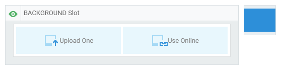
As the background of other slots, it’s displayed as a deep blue grounding in the block icon. You can upload an image or use online images as the background image. The aspect ratio of background image is fixed.
Background slot can be found in general blocks and header blocks, in which background image is displayed differently:
In header blocks background image will not be shrank. The original size will be strictly kept. The image width could be larger than the body width, but no larger than the page.
In general blocks background image will be scaled to the same width of the body’s so that it occupies the entire body background.

Image Slot
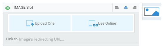
Other than background image, the image in this slot doesn’t occupy the entire body background. Instead, there will be margin left around the image edges. You can also link the image to a URL where you can click and redirect to.
In different types of blocks, the sizes and positions of images can be different as well. Some take an entire row; some stick to the left/right, taking half the room; some get crossed by a dividing line.
Text Slot
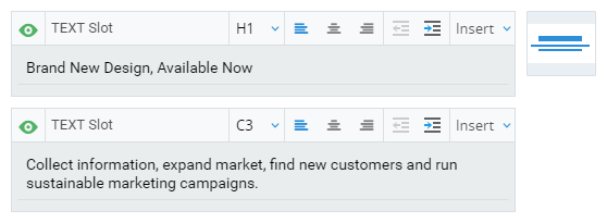
Text slots usually come in pairs: headline and content. They are pretty much the same, just with different default font. You can adjust aligning style and indent. You can also insert a link and Contact variables. There are 9 types of texts in terms of typesetting: H1-H4 (Headline), C1-C4 (Content), Q (Quote). You can set the font of each type in Appearance and then select text type while editing the slot.
Button Slot
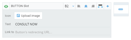
You can edit the button text and set a redirecting URL. You can also upload an image as icon which is displayed on the left of text so a small-size image is suggested.
You can switch button colors and text fonts by choosing among B1, B2 and B3 which can be adjusted in Appearance just like text types. Besides, you can adjust aligning style in the button and button width. The default button width is self-adaptive to text and it can be adjusted to as wide as the body.
You can add buttons like grouping blocks. You can have 3 buttons in a row at most.
Navigator Slot

It’s in the advanced blocks and also usually combined with other block in header and footer. Navigators are a bunch of hypertext links where breaks and “|”are inserted.
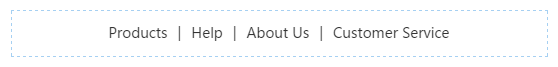
You can edit the texts, links, aligning types and navigator numbers. You can also choose fonts among M1, M2 and M3 which can be adjusted in Appearance.
Divider Slot
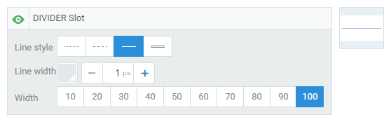
It’s usually in the divider blocks and some header/footer blocks. It’s similar to Section Break in Form widget that you can add a divider line in the mail. You can also change the width, the color and the size of it.
Items

The first two blocks of advanced block are made of “items”. Editing these blocks is as good as editing the content of items. Item is not a slot but a combination of slots. It’s like grouping on the vertical level with unlimited number, which is similar to navigators.
The slots in each item are the same, as well as the types of the same slots. Click the item and you can edit the text, image and button slots one by one. The dots and lines are default and they increase as items increase.
Space
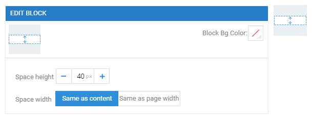
Unlike slot, “space” is a “blank” block that consists of no slot.
“Space”serves as a divider to adjust the space between blocks. You can adjust its background color, height and width.
There are two width: same as content; same as page. When it’s same as page, it covers the entire width of the page. Using this feature, you can divide the body into several cards:
Appearance
Apart from the background setting of page and body, appearance editing mainly concerns about fonts and colors. All the texts, buttons and navigators that you edited previously can be further tuned here.
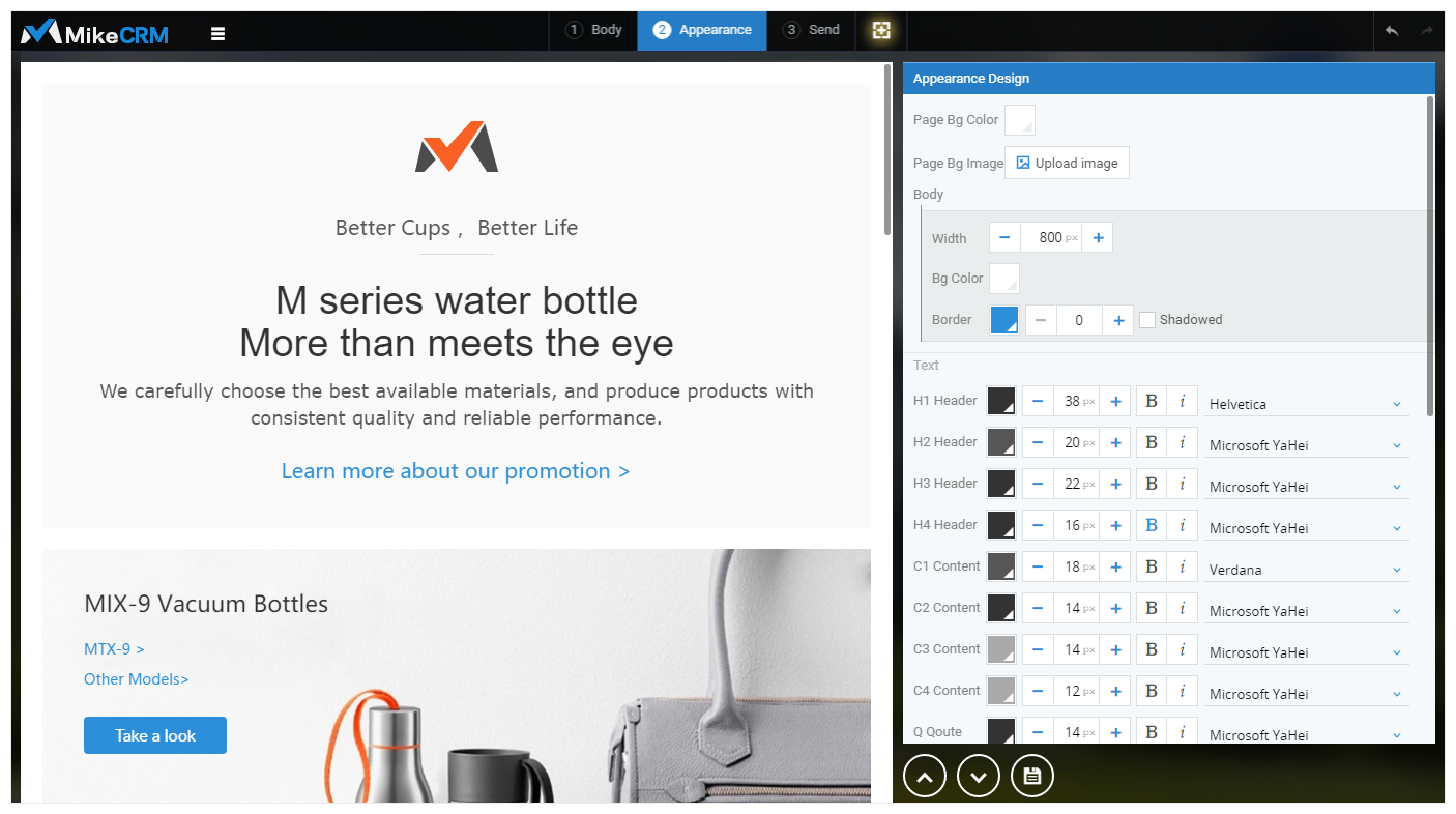
Overall setting

You can set the overall style on the top right.
You can customize the background color or upload your own image as background. You can also add a border to body by changing the border width from 0 to other number. The border width is within the body width, which means the wider it is, the narrower the body is. Besides, you can make the border more perspective by enable “Shadowed”.
Tips: out of designing effect, the border is not displayed where header/footer meets the body. You can add a divider block here of which the width is “Same as content” and then the border could be seem.
Style Settings
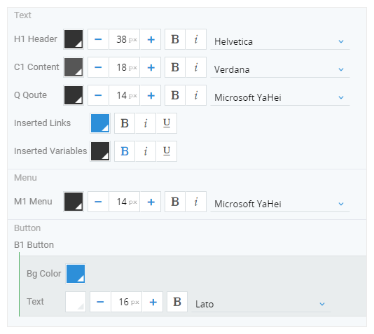
Then we move to texts, buttons and navigators types.
- Text types includes header (H1–H4), content (C1-C4), quote, link and variable. You can edit the font, including color, typesetting, size, bold and italic. The typesetting of link and variable depend on the text types of the slot they belong to. But you can set the color, bold, italic and underline to make them more distinguishable.
- Navigator types includes M1, M2 and M3. The font setting is the same with text’s.
- Button types includes B1, B2 and B3. You can change the button color and the text color, typesetting, size and bold.
Effect Preview
On the left is the preview sector. When you move the cursor to a slot, it shows its style type. Accordingly, when you move the cursor to a style type on the right, it shows which slot is using this type on the left.

Last But Not Least
In MikeCRM, mail is not edited in a fully customized manner. Instead it comes with slots and blocks, presenting you ready-made content styles, which make creating a mail so easy. All you have to do is replacing the text/image with your own and adjusting font/color. You don’t have to be a designer to design a neat and stylish mail. Besides, another perk of doing so is your mail can self-adapt to all kinds of devices/software, saving you the trouble to design patterns for each model.
Let’s hope this handy and effective mail editor could boost your EDM marketing to an unreached level.