Although we have made creating a Form so easy for you, you have to put some real thoughts into it in order to make it amazing. Here are 10 tips to make a slick and friendly Form. Check it out~
*The following tips are advised upon different scenarios, please adapt on your own discretion.
NO.1 Select the appropriate width for the input box
The width of the input box should match the content if the content is a fixed format such as mobile phone, zip code and email.

Recommending feature: Adjust Widget Width

NO.2 Use multi-line layout to save space
If a lot of input boxes were lined up, it could end up into an extremely long form. In order to avoid that, you can put multiple input boxes in one row to save space.

Recommending feature: Squeeze up to allow several widgets in a row.

NO.3 Choose the right layout for you widget
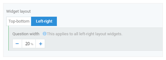
If there are a lot of information to input, the Left-right layout would be a better choice than Top-bottom layout. It’s easy to browse and greatly reduce the length of the form. (p.s. It’s better off to stick with Top-bottom layout on mobile device so it’d self-adapt to such layout. )

Recommending feature: Widget Appearance setting – Top-bottom/Left-right
NO.4 Calls To Action
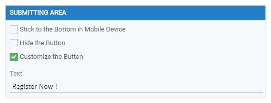
The “Submit” button could more indicating of its purpose, such as “Confirm Application”, “Buy Now” and so on. It would yield better conversion rate and income.

Recommending feature: Form editing – SUBMITTING AREA – Customize the Button
NO.5 Show all options if they are less than 4
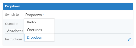
If you use a Dropdown, the submitter has to click twice to select an option so don’t use the Dropdown unless there are more than 4 options. If there are more than 25 options, use Chained-dropdown to make it neat.

Recommending feature: Widget editing - Switch Widget type, Chained-dropdown

NO.6 Use Placeholder to highlight your point
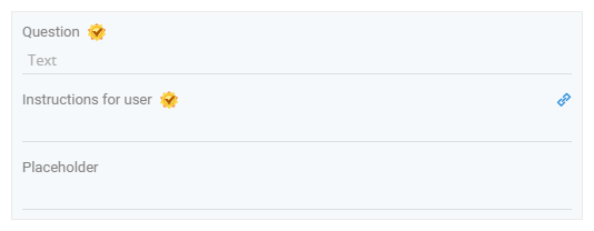
The Questions shouldn’t be too long. It would be clearer to use Placeholder to highlight your point.

Recommending feature: Widget editing – setting Instruction for user
NO.7 Set the right line-height for text
If the line-height were too small or too big, it’d make reading difficult. Adjusting the line-height can make the text clearer.

Recommending feature: Form Appearance –Form Font/Line-height

NO.8 Set Bold & Font size to make it more legible
Make the questions bold and select the right font size. It would make your form more legible and stick-out.

Recommending feature: Form Appearance – set the Font size, Color and Bold

NO.9 Arrange images in a suitable manner
If you have many images to display, putting them in one line could end up with a very long page. Instead, you can put several images in a row.

Recommending feature: Static Image – Set Number of Image

NO.10 Clarify the content
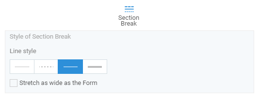
Use Section Break to set apart different information categories such as personal info (Name, Birthday), ID (Account, Card No.), Contact (Address, Email, Mobile Phone).

Recommending feature: Section Break
These are the 10 tips we’ve come up with for our users. Hopefully they would shed some light for all form creators and help you design more friendly forms to attract more customers and users.
Better form, better business!


