
In the Submit Manager page, besides the List view that shows Submit details, there is the Charts view visualizing the Submit data. In this article, we're going to introduce the charts which are included in the Charts view.
Submits/Views Combo Chart
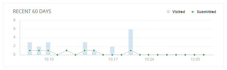
At the top of the Charts view, there lies a combo chart showing the trend of the pageviews and the Submits over the last 60 days. The light blue column stands for the pageviews, namely the number of times the form is visited by different people; the green line with markers reflects the quantity of Submits, that is, the number of Submits the form has collected each day.
Normally, the quantity of pageviews should be absolutely larger than that of Submits. Please be vigilant if you find that the pageviews are less than the Submits, because it might be caused by malicious methods like votebots.
Question Analytics
The following section is statistical charts for each question. Please note, only the select-type and numerical questions will have statistical charts. That's to say, we can generate corresponding statistical charts for these questions, based on the selected times of each option in the select-type questions and the number values collected in the numerical questions.
Pie Charts and Bar Charts for Select-type Questions

Typical select-type questions are created by those form widgets including radio button, checkbox, dropdown, image radio, image checkbox, title and gender. As the picture shows, the total number of times each option has been selected is listed out at the right side, so is their percentage. And the related pie chart is generated and displayed at the left side with fine-tuning colors for each slice. Really beautiful, isn't it? One more thing, you may switch the chart type between Pie Chart and Bar Chart by clicking the icons at the top right corner.
Rating Widget
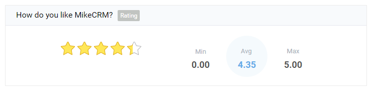
The analysis for rating widget picks out the maximum point and the minimum point in all Submits, and also calculates out the average point.
Number Widget & Currency Widget
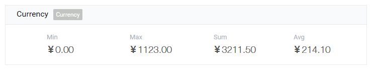
The analyses for number widget and currency widget are almost the same, except the currency analysis has an extra currency symbol. Their statistical items are similar to those of rating widget. In addition to the maximum value, the minimum value and the average, there is one more item "Sum" that aggregates all the values collected through the number or the currency widget.
Ranking Widget
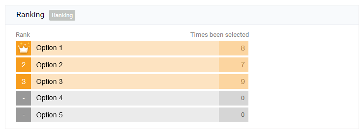
The purpose of analyzing the data of a ranking widget is to know the position of each item in the ranking list. However, you may not use the ranking statistical feature unless you purchase the extension "Rank Calculation", which ranks each item by their average position. If you want to know the detailed rules of the rank calculation, please visit the article Introducing Rank Calculation Extension.
Linkage Widget

Linkage is such a special type of dropdown widget that has multiple levels and can be used to design multi-level dropdown questions. The statistics for linkage are divided into separate levels, and every select-type level has its analysis presenting the selected times and the percentage of each option.
Tabular Widget
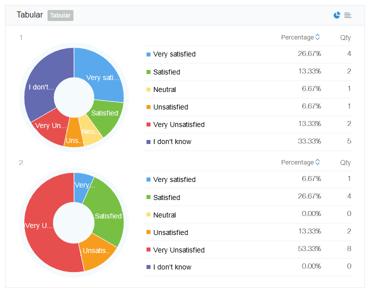
Actually, a tabular question is a set of questions that share the same answer options. So its statistical charts consist of multiple charts demonstrating the statistic of the corresponding question.
Exclude Outdated Data
The checkbox "Exclude outdated data" locates at the top of the Charts view and is next to the "Charts" tab. By default, it's checked and used to deal with the situation that the form content has been modified in the course of collecting data.
For example, one multiple choice question once had had an option "A", and you deleted it when you redesigned the form. However, deleting the option "A" in the form will not remove its data in the Submits collected, which may affect the statistical chart. It's the place where the feature comes into use. With the "Exclude outdated data" checked, the historical data about the option "A" will not be included in the analysis. On the contrary, if it is unchecked, the option "A" will be counted into the statistical result. In this way, you may decide by yourself whether to include the historical data in the Charts or not.
Other Features
Through the above introduction, you may have gotten a clearer picture about the Charts view. So useful the Charts view is, can it only be viewed after you have logged in the MikeCRM site? Of course not. We have provided you with other methods to make the best of the Charts: export the Charts as a PDF file, view the Charts in WeChat, and share it with people who have just submitted one form.
Export Charts
Under the Charts view in the Submit Manager page, you may click the "Export & Download" at the top right corner. After a while, a PDF file will be downloaded with the same content you see in the Charts view. In this way, it can be easily used as your report material.
View in WeChat
After you follow our official account in WeChat and link your MikeCRM account, you may conveniently browse the List view and the Charts view of the Form-Submits in WeChat.
Share with Others
In the form design step "After Submits", you may check the settings "Disclose all Submits– Show statistical diagram" to share the charts with others. Furthermore, you may customize the statistical diagram of certain questions to be shared. By doing so, when someone has just submitted a form, a "View Analytics" button will be displayed in the After-Submit page. Clicking the button, he or she can browse the shared statistical diagram. This feature works best to present the real-time voting result to people who have just voted.